Noosa Branding & Website
Client
NOOSA
Agency
SIGHTBOX STUDIOS
Year
2022
Noosa offers premium brands the ability to reward select customers with an exclusive deferred payment option that is controlled and monitored by the brands themselves. These brands are able to then elevate the customer journey, while maintaining a premium experience that builds deeper relationships between them and their customers.
The Challenge
Noosa targets premium brands to use their technology throughout the customer buying journey. The challenge was to build a brand that could not only appeal to the CMO’s of these other brands, but also tell its story through the eyes of an end consumer to show its true benefit. The Noosa brand needed to be somewhat agnostic towards other brands, allowing these brands to be the focus in communications, while remaining strong enough to stand alongside them.
The Concepts
To achieve a strong visual style that could let partnering brands remain the hero in the overall product story, I started with a pure black and white color pallet, a minimal visual style, and modern typography.
I created two distinct directions that still adhered to the overall brand strategy. I used style tiles as a method to convey what the imagery, typography, color and could potentially look like in various applications.
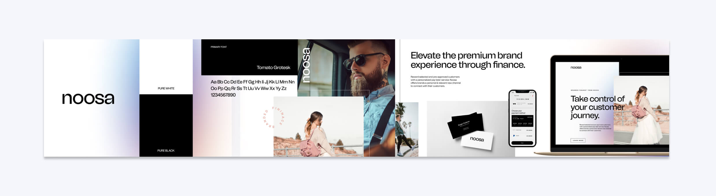
Concept .01/ Bold, clean, typographic, premium feel, with a subtle hint of color through an iridescent gradient. Leaning heavier on the unique typography of a san serif, that also has the visual interest and detail of a serif, resulting in a modern visual style that could speak to a broader brand audience.
Concept .02/ Slightly delicate, elevated, premium feel, utilizing color exclusively from photography and blending both serif and sans serif fonts together in the typography. The ring concept could be used as a pattern but also highlight important aspects (ie. products) in photographic compositions.
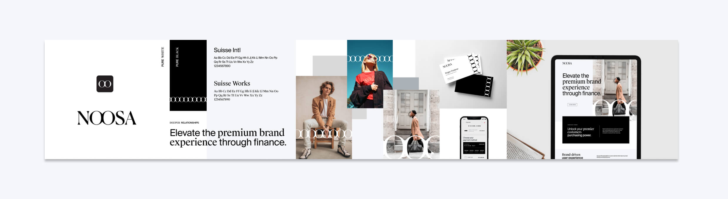
Logo Development
Concept .01 was chosen by the client as the direction to pursue, but with the added visual icon that was present in concept .02. The double O’s in the word are where your eyes are drawn to at first glance, and I wanted to take the visual interest of the O’s and make them ownable.
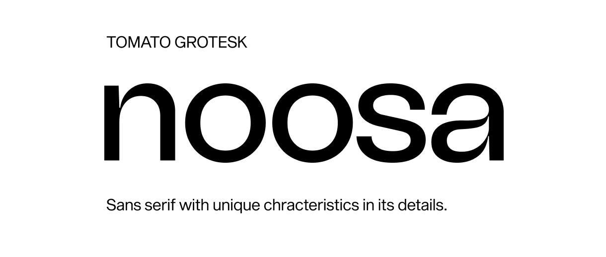
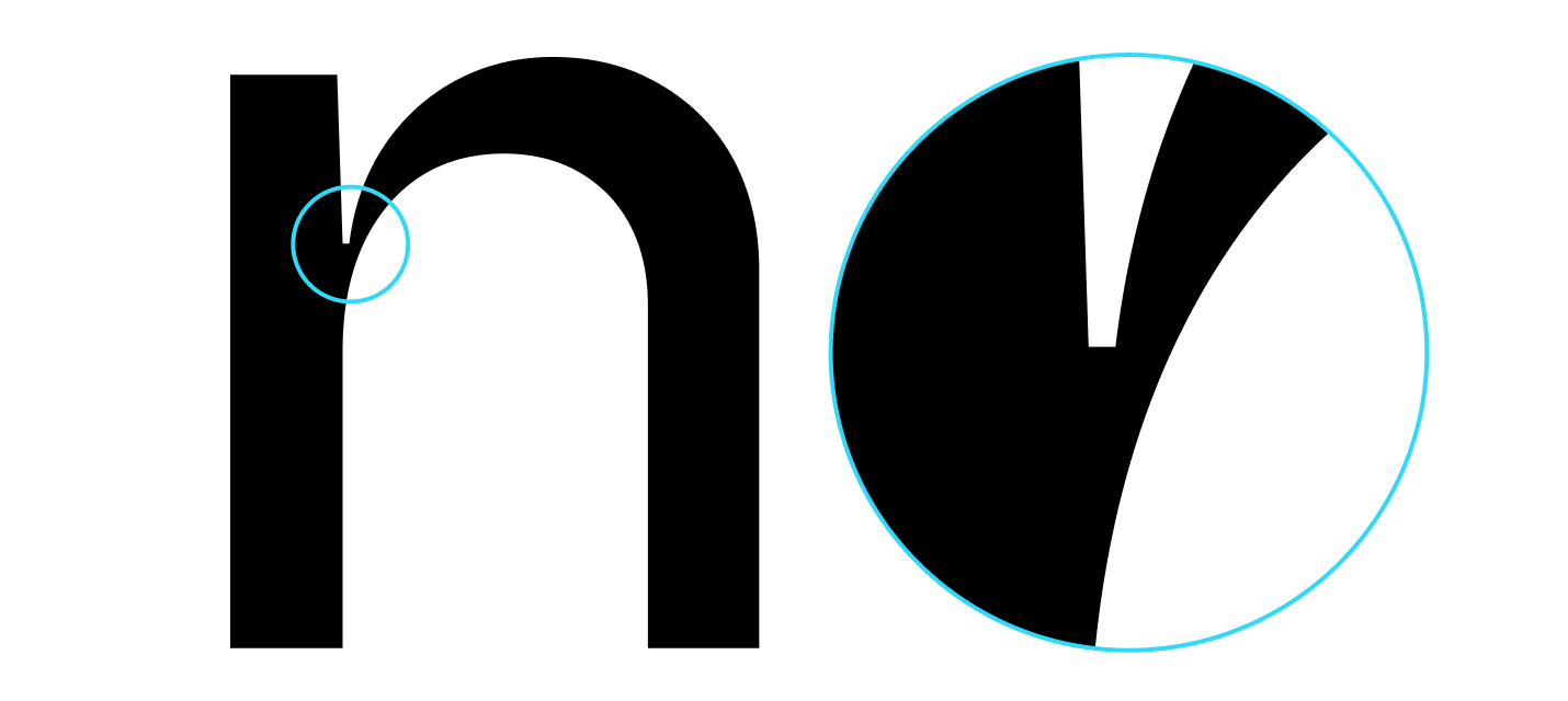
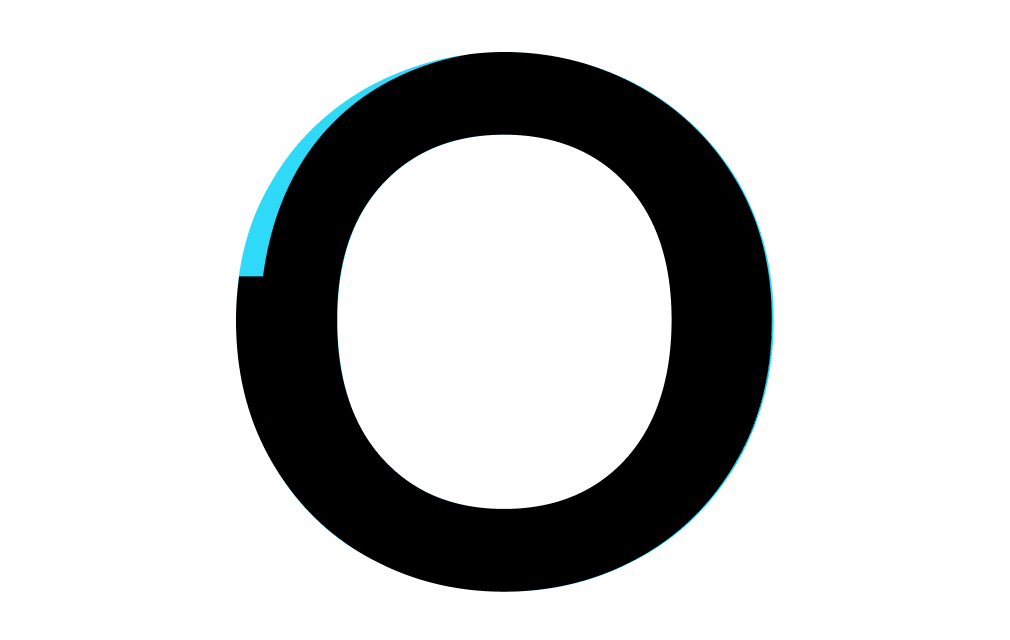
On a suggestion from my fellow designer, Andrés Soler Bíderman, I took the unique details of the font and applied it to the “o’s” in the logotype to create an original wordmark, which then sparked the opportunity to use a single “o” for the distinct icon.
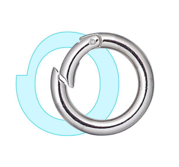
While manipulating the new icon, I found that it began to resemble a clasp. Clasps are generally associated with jewelry and premium materials, making this a perfect metaphor. This was a bit of a happy accident, but I wanted to lean into that concept and make it more prevalent in the icon. This resulted in the appearance of a light reflection on the “o’s” at smaller sizes, which gives a nod to the premium feel I was looking for in the brand.
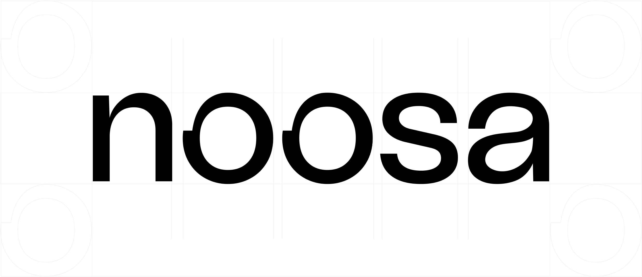
I then adjusted both the “n” and the “a” to reduce the delicacy in the details, so as to not distract from the “o’s” in the overall wordmark, based on feedback from the client. I adjusted the letter spacing to be uniform resulting in heightened readability at smaller scales.
Brand Applications
Once the logo was finalized, I created a brand guide that included some examples of how the brand could be utilized in various applications.
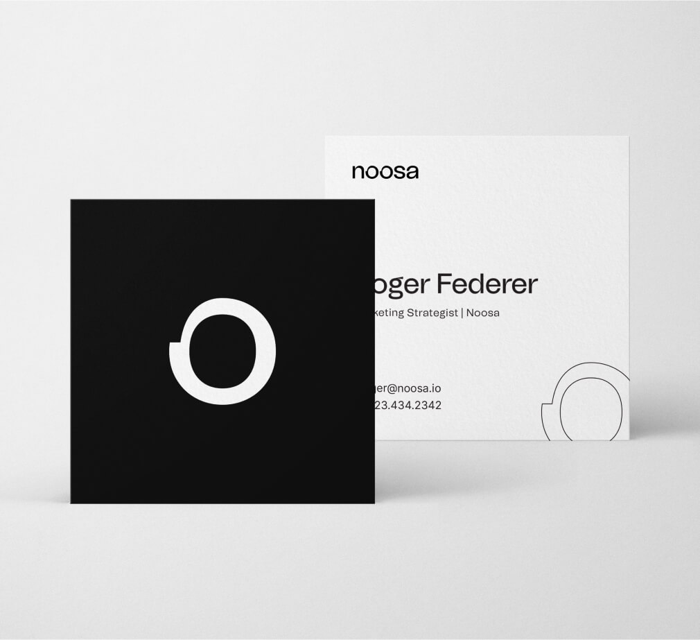
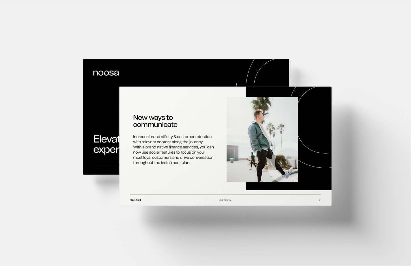
I created a sample business card design, and sample presentation slide design to show the potential and flexibility of the brand between digital and print applications.
I also explored how the new brand could be applied to motion and video.
Iconography
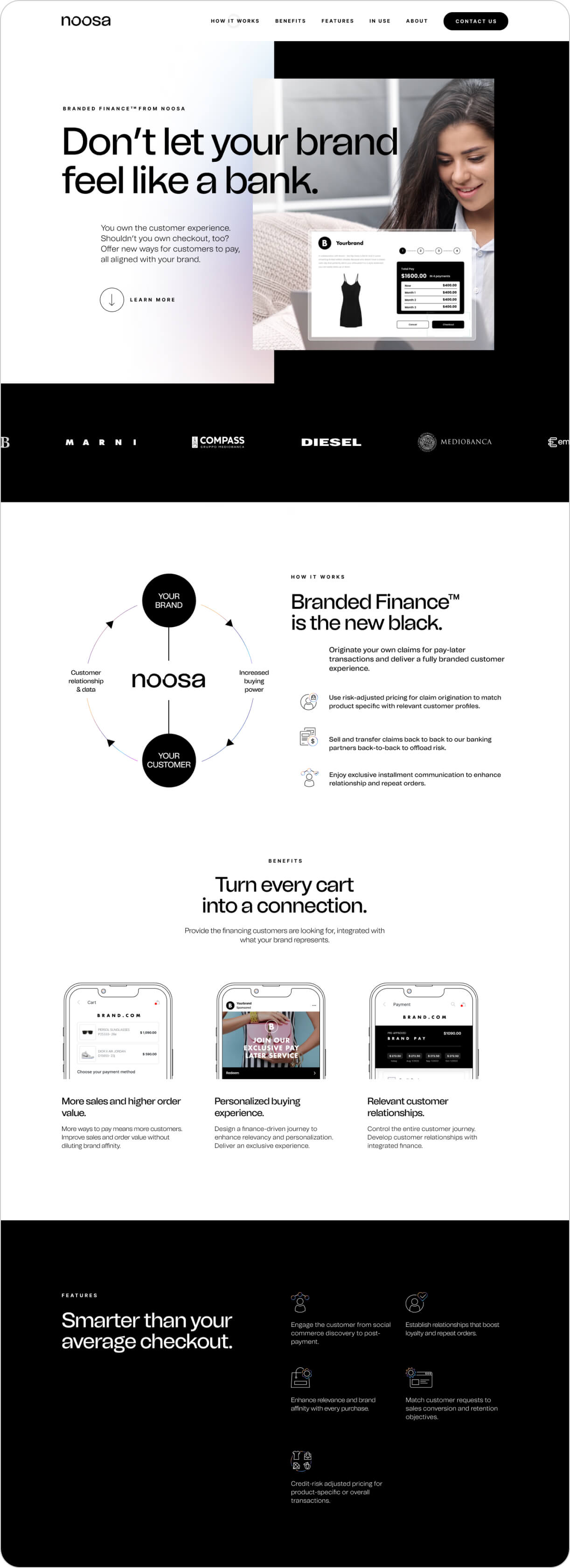
When I started to build out the brand experience via a new website, I created a small library of custom icons. To keep the premium look and feel throughout, I used thin outlines with subtle use of the iridescent color gradient on secondary elements within each icon.
Imagery
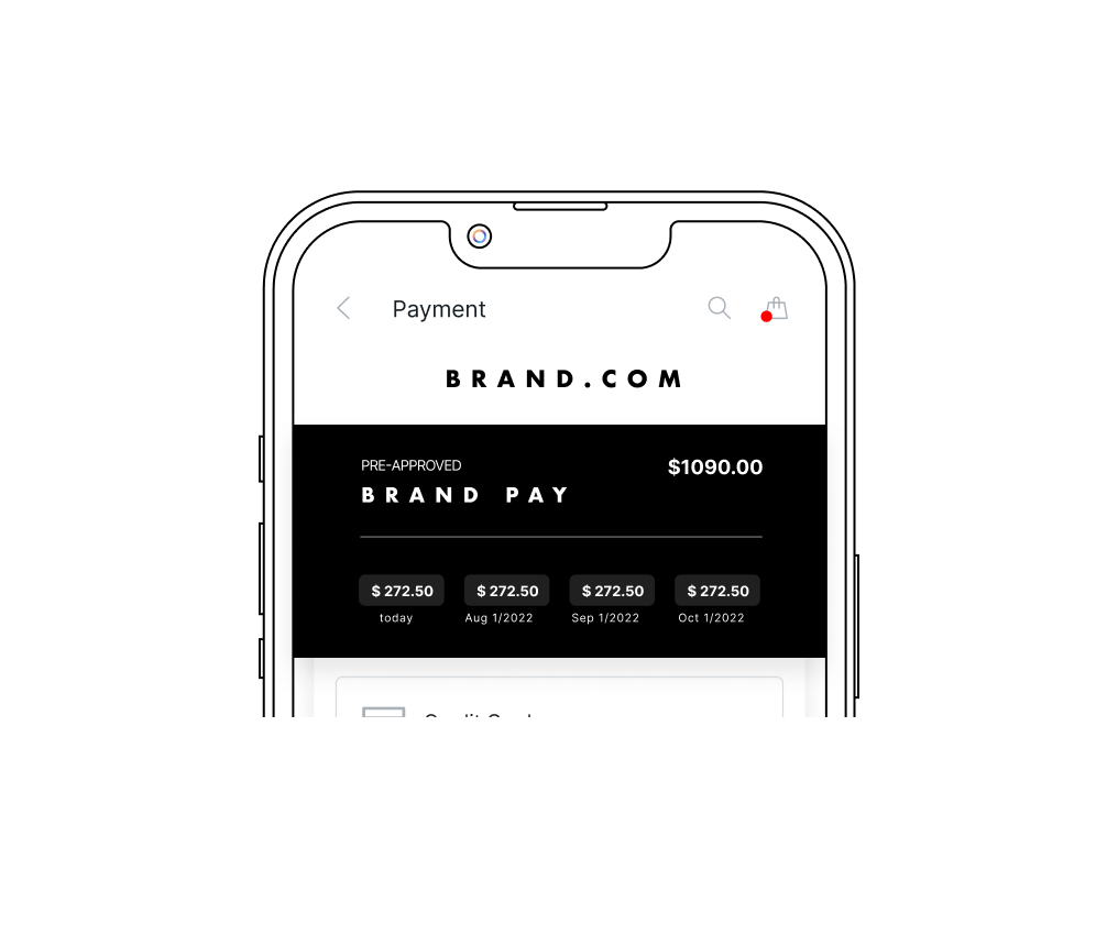
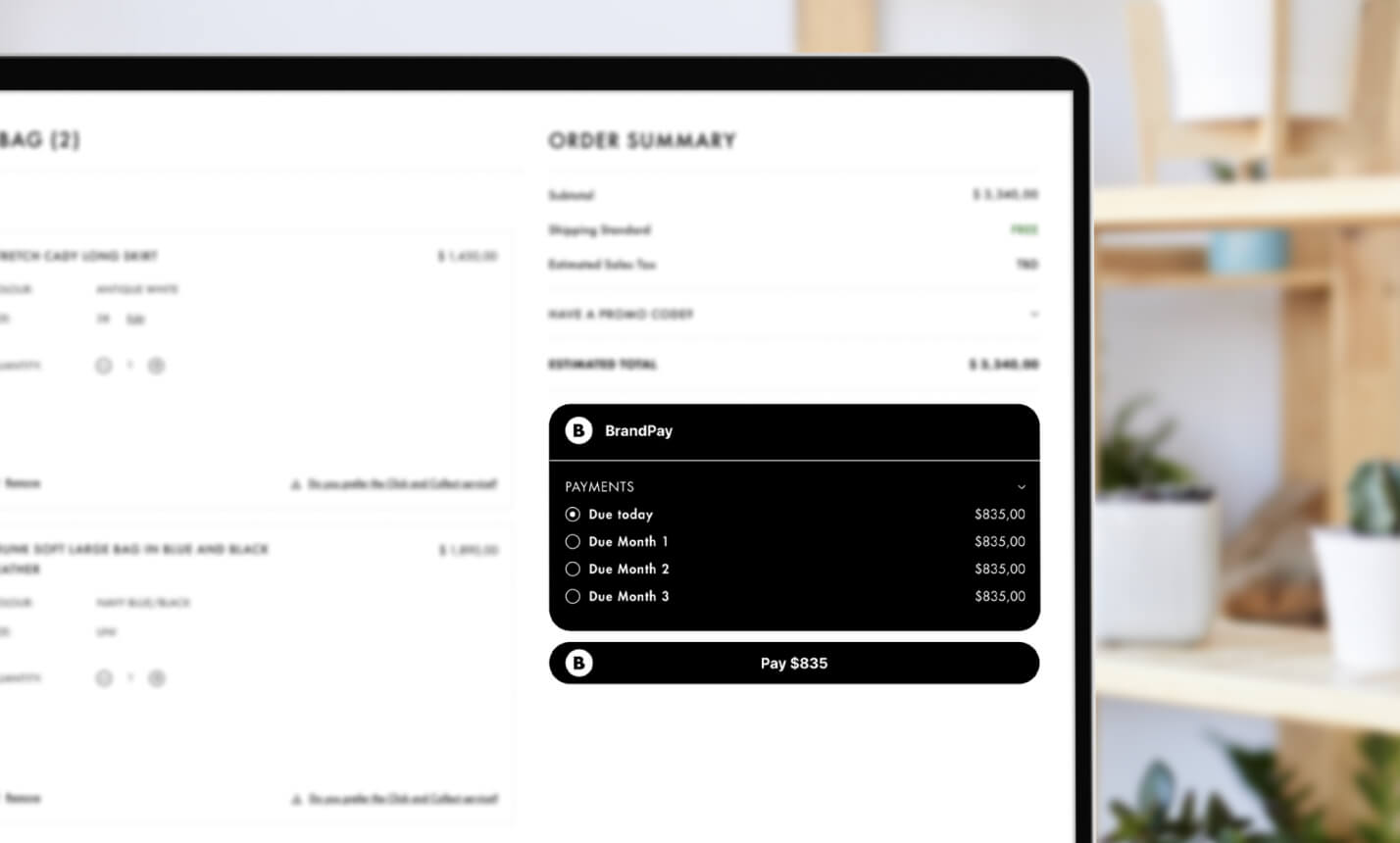
Along with custom iconography, I created a unique visual style to display product shots in a mobile environment. I used the same thin outlines as in the icons to create consistency around the same premium aesthetic for focussed benefit product shots. For end consumer situational product shots, I used a photographic style that was kept clean, bright, focussed on important aspects, and in use case environments.
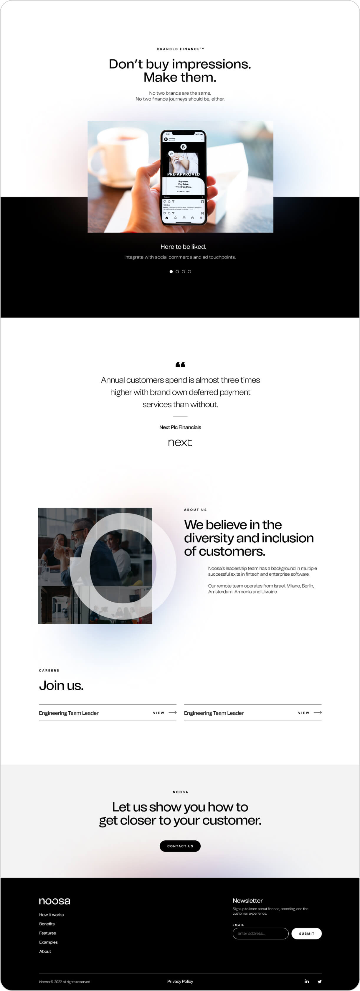
Completed Website
Once the design was completed, I worked with our development team to ensure the website was built with attention to detail. I tracked bugs (via BugHerd) and supported the developer with formatted assets and clear documentation throughout the process.