Procurify Branding
Company
PROCURIFY
Role
LOGO DESIGN
BRANDING
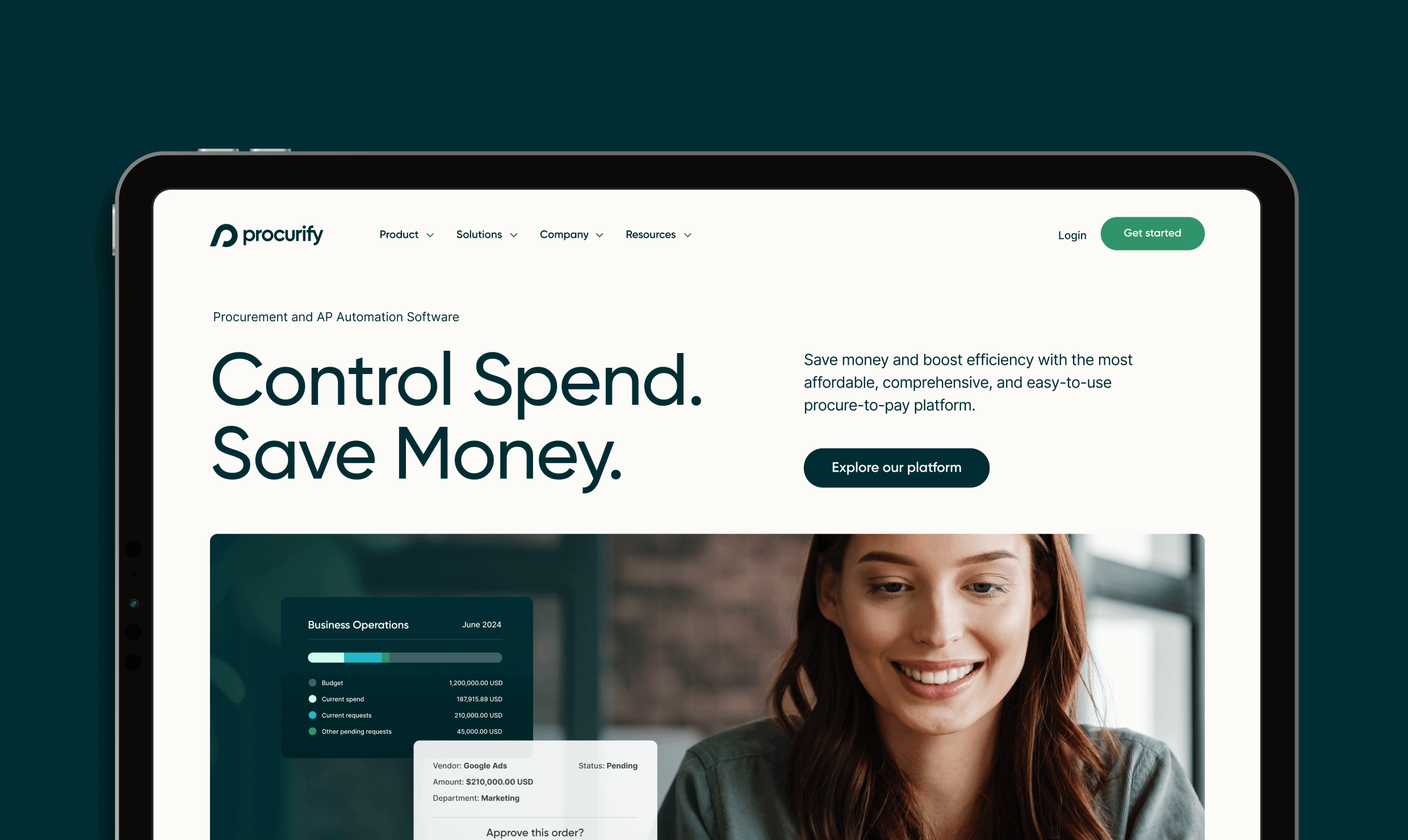
WEBSITE DESIGN
ILLUSTRATION & ICONOGRAPHY
MOTION DESIGN
Year
2023—2024
Procurify is the spend management company, on a mission to give all organizations unprecedented visibility and control over their business spend. As Procurify’s product was evolving, so was their market opportunities. The company was positioning itself to market their product to larger sized organizations. In order to appeal to the mid-market, the brand would need to be repositioned to speak to these organizations and reflect the evolution of the product.
Samples of Old Identity
The original Procurify brand consisted of a colourful, friendly, somewhat bubbly illustrative design style. The logo was a morph of the letter “P” and a rocket, paired with a curvy san serif logotype. The brand also had a mascot, “Dash”, a cute sloth.
Over the years the Procurify brand had accumulated varying graphic styles and a wide colour pallet that weakened the overall brand. The cute, bubbly brand was also not well aligned with the new target market of larger, more serious companies.

Competitor Research
One of the first steps in a re-brand, is a full inventory of current graphic styles and assets of not only the current brand, but also its competitors in the market. I did a morphology analysis of the competitive landscape which included colour pallet and typography analysis of logos.
I then dug a little deeper into each competitors digital brand and collected each of their hero statements, vision statements, graphic styles, iconography, imagery, and website designs. When all compared together in one overall view, it was then possible to find opportunities for differentiation.

Logo Exploration
Sketching is one of the most valuable stages in the logo process. This is a visual exploration that can lead to new ideas that I may have not considered in initial notes and thoughts.
During this stage, I just explore what works and what doesn’t to discover which shape expresses a brand's mood in the best way. Sometimes it’s on paper with a pencil, and sometimes it is just rough digital sketches in Illustrator. Here, I did both.
Shortlisted Directions

Evolution/ An slight evolution of the current logo. Simplified and familiar.

Growth/ Organic leafy shapes forming a “P”. The winding leafs, a metaphor for growth.

Data & Analytics/ Geometric “P” shape inspired by donut graph blended with organic rounded edge.
Brand Moodboarding

Initial Moodboard/ Created using collected inspiration blended with some current brand messaging. Design styles and layouts that speak to a mid-market brand.

Evolved Moodboard/ I updated the moodboard using sample brand elements that I created (still in progress), including iconography, typography, colours and imagery.
Finalization
Settling on the data & analytics direction, I explored ways to incorporate more of the brand characteristics. Speed was achieved by skewing the logo at an angle that aligned with the “y” letter of the logomark.
The logo now had a multiple of the characteristics I was looking to incorporate: simplicity, speed, data, analytics, and even a subtle nod to “Dash”, the sloth mascot which was retained for internal only culture related assets.
Logo
Brand Guidelines

Visual Language


The Results
(Data collected over 5 months before re-brand and website launch v.s. 5 months after.)
ICP Demo Requests
For the target mid-market customers, product demo requests increased from 467 to 591.

ICP Conversion Rate
For the target mid-market customers, conversion rate increased from 0.21% , to 0.29%.

Average Scroll Depth
The average number of people that scrolled past the mid-point of the website pages increased from 20.3% to an average of 23.8%.

Average Time on Site
The average time spent on the website increased from 1:42 to an average of 1:49.
