Stacado Website
Client
STACADO
Agency
SIGHTBOX STUDIOS
Year
2022
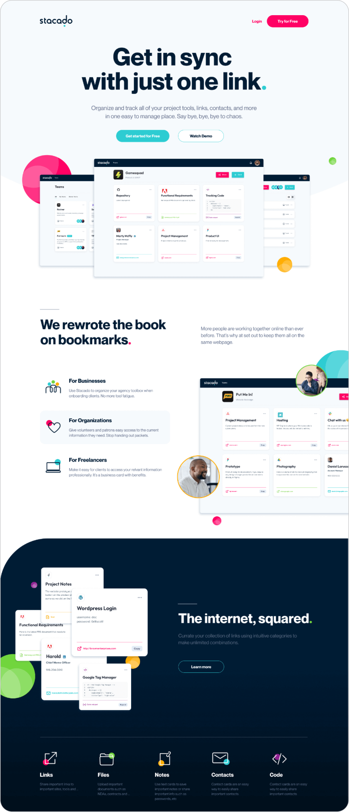
Stacado is an app that allows teams to easily share and manage links, documents, notes and code in a centralized location. As Stacado’s design director, my role for this project was to lead the overall design style of the digital brand. I designed the website, social banners, and helped the product team finalize a theme for the app.
Color Pallet
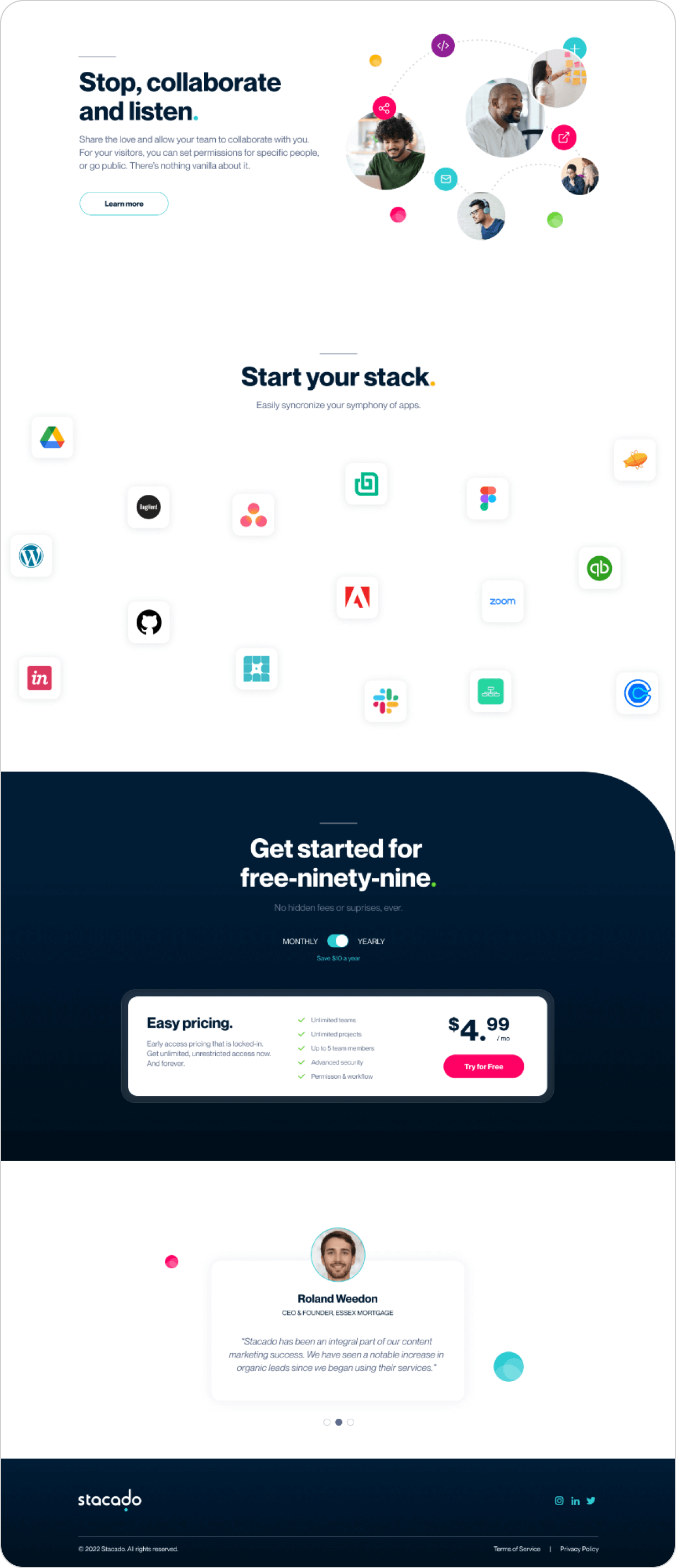
The app is about collaboration and sharing multiple media types between teams in a wide variety of industries and sizes. The app needed a distinct, vibrant and fun color pallet that could be used to delineate between the various media types.


Design Elements
The spheres were based off of a common visual used to represent a network. Here, the spheres represent the team members at the end of each connection as well as the range of media types.
Typography
I chose Neue Montreal for its clean, balanced, and bold characteristics. It’s easy to read, versatile and timeless.


Iconography
I created iconography with simplicity in mind. Using minimalistic strokes paired with small spheres ensured cohesiveness with the brand while remaining strong overall.
Product Imagery
The Stacado product UI is beautiful and self explanatory, so I wanted it to be front and center when explaining how the product works. Spheres and user photography were used to support and provide context to content themes.
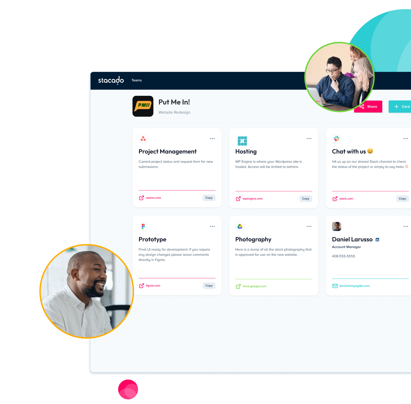

Showing a variety of faces and situational photos was important to making the product relatable to potential users.
Animated Interactions
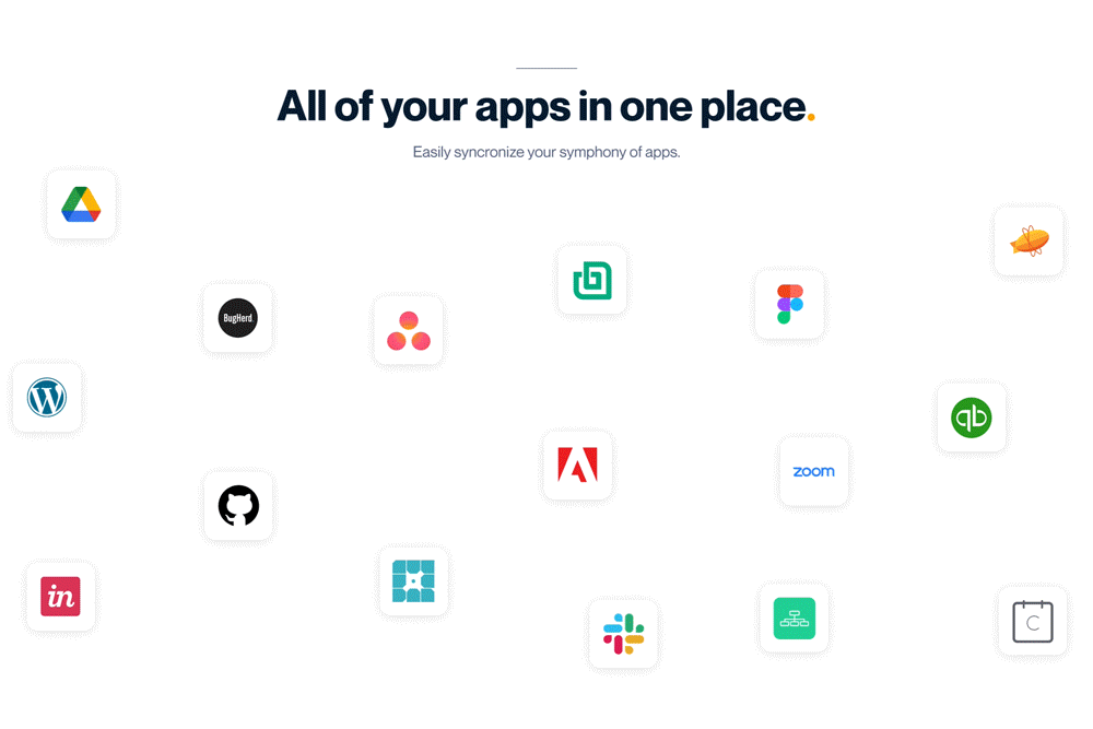
I like to make sure when using animations in web interactions that they make sense and have a purpose. In this case I wanted to show apps coming together, as they do in the app itself, as the user scrolls. I used After Effects for the animation and exported as a Lottie (.json) file for web implementation.
Completed Website